


The challenge
There was no structured data on women in India’s climate workforce. Just scattered powerful stories, and fragmented insights but no clear way to see the bigger picture. The challenge was to bring clarity, structure, and visibility to what the data was trying to say.
Designing for Impact
Our goal was to make a report that does not sit in a folder, but something people could read, understand and remember. We designed the report to be readable and relatable with not just clean layouts, but clear thinking.


Reimagining Data
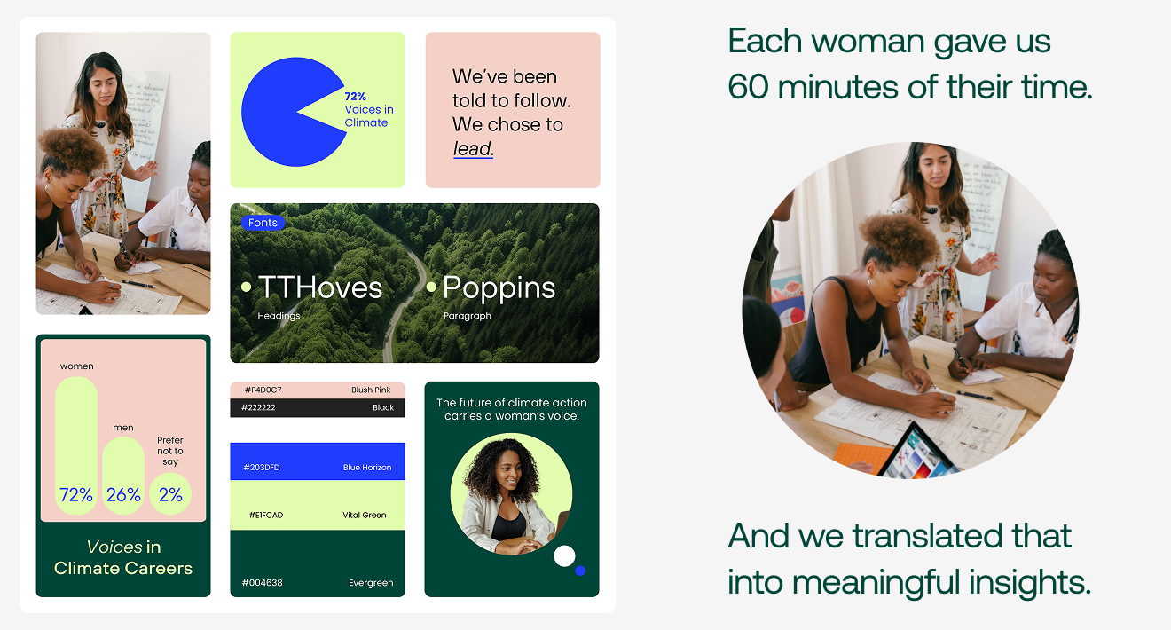
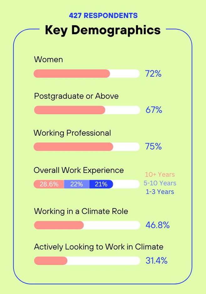
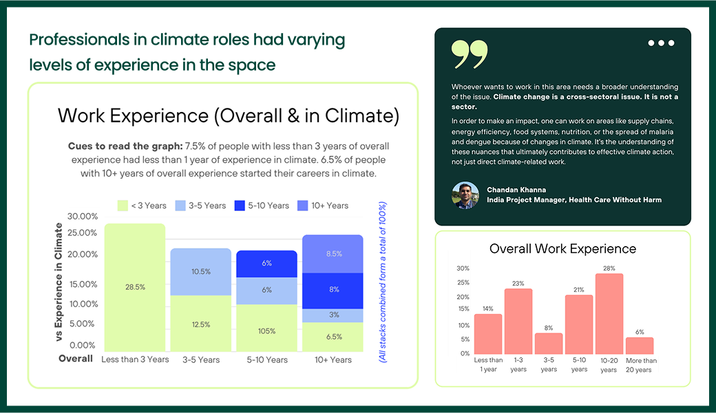
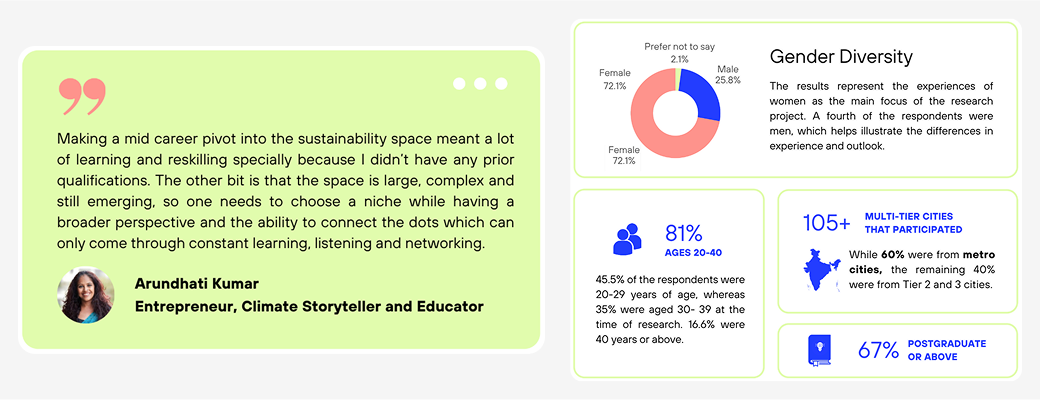
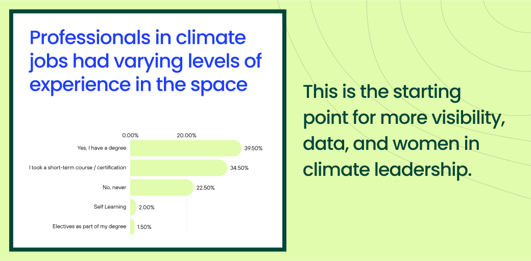
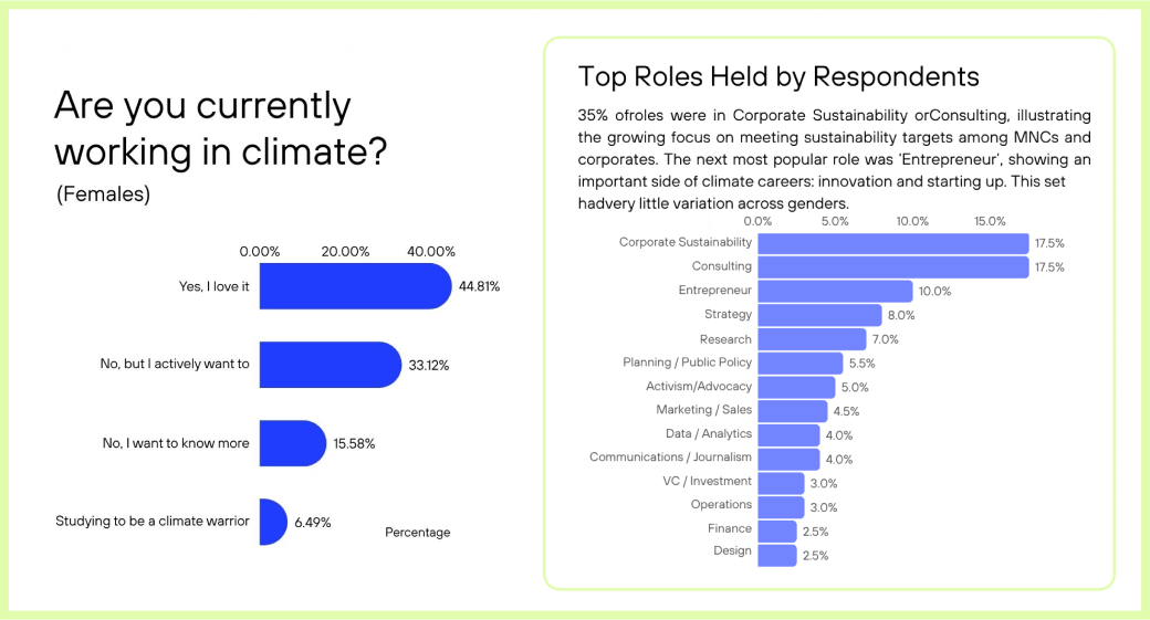
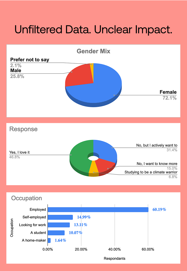
We made sure that there no unreadable, overwhelming blocks of statistics. We used infographics, charts, and scannable layouts to help people see what the data was saying.Long Paragraphs → Visual SummariesSpreadsheets → Readable Data PointsNumbers → Real-life context
%201.png)

Impact
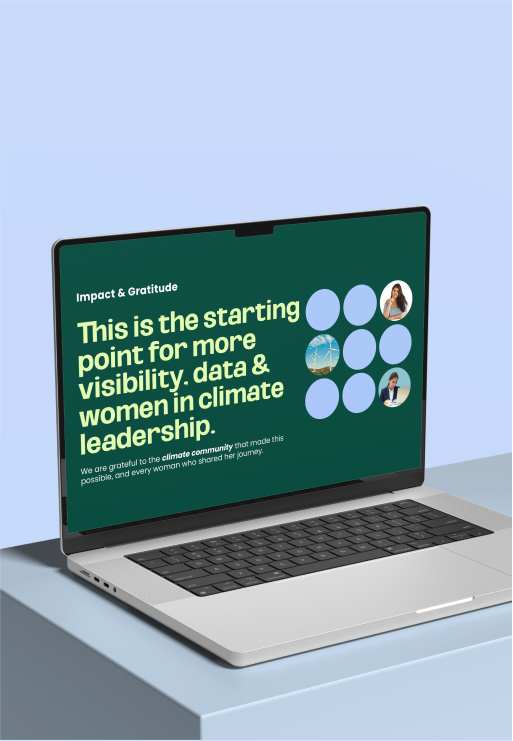
This is the starting point for more visibility, data & women in climate leadership. We had over 1050+ downloads within 2 months of the report launch, and we hope for more women in climate careers!

Upload Digital brought our vision to life, beautifully and seamlessly. They didn’t just design visuals; they translated complex data into stories people could actually understand. We couldn’t have asked for a better creative partner.
Aastha Bharadwaj
Founder, Climate Hires